Ducky Tea

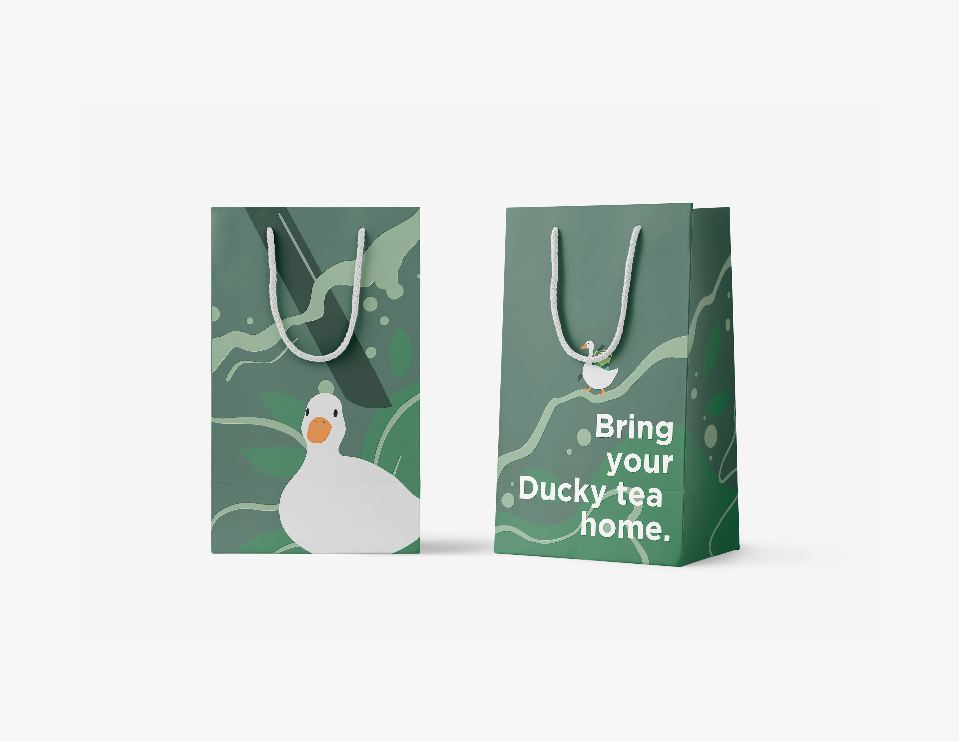
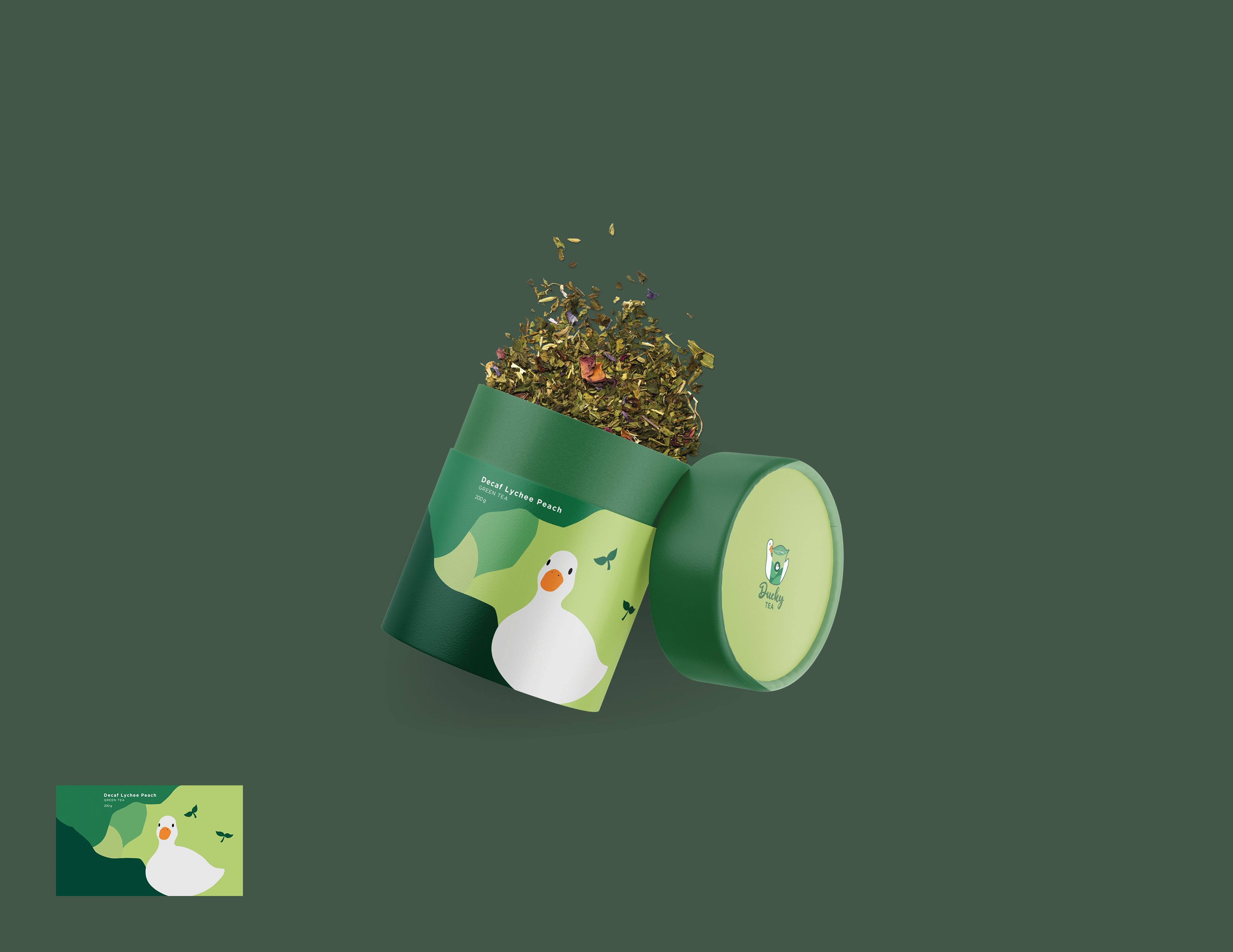
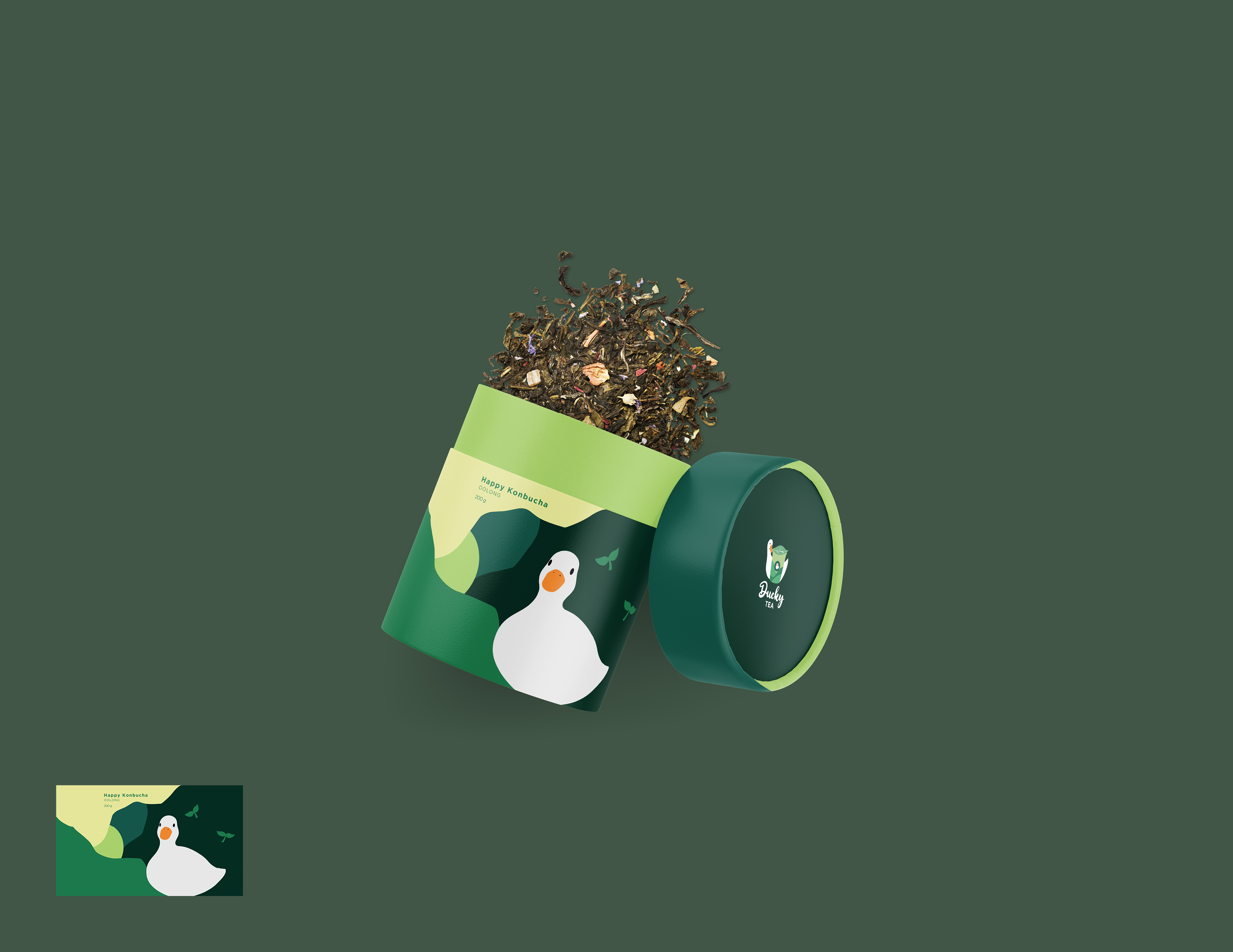
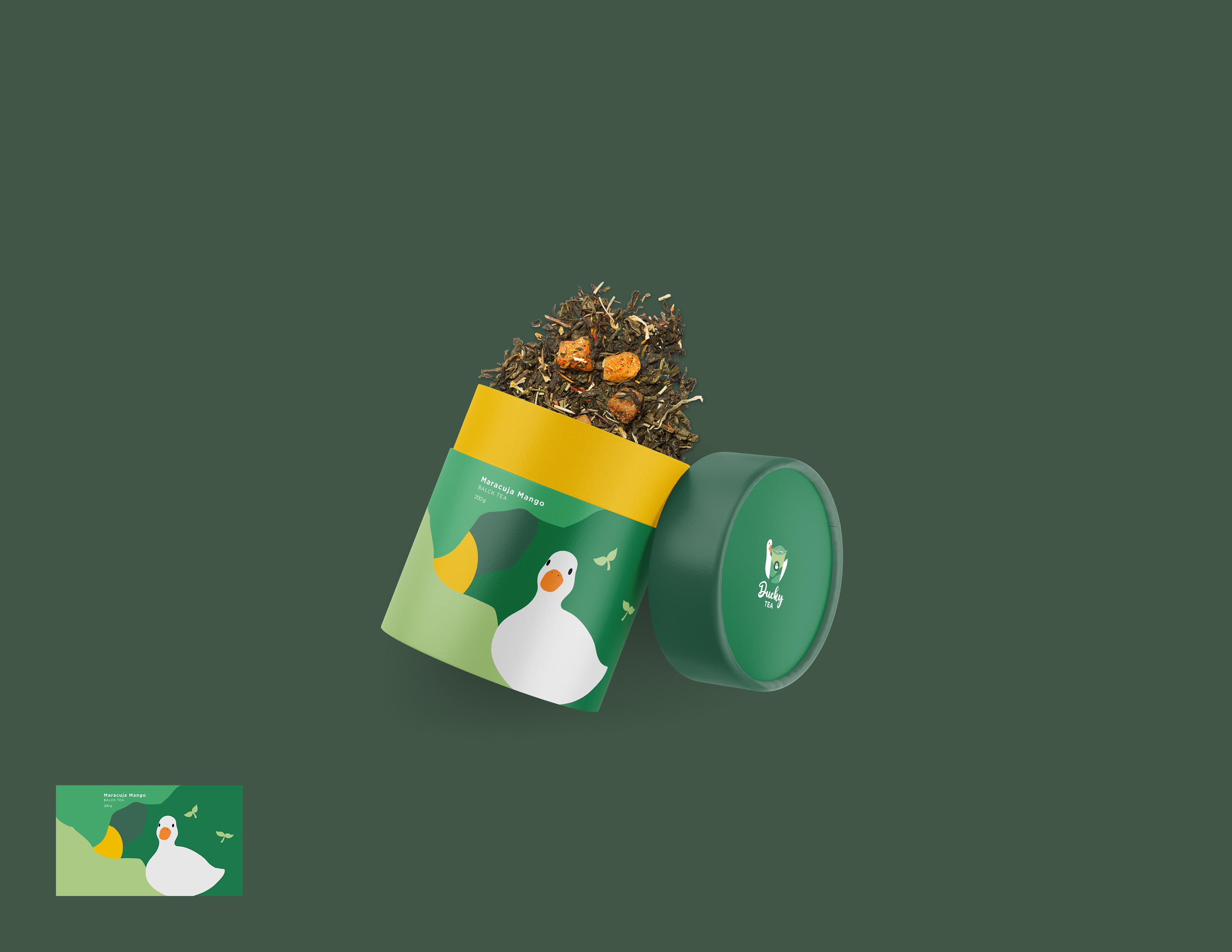
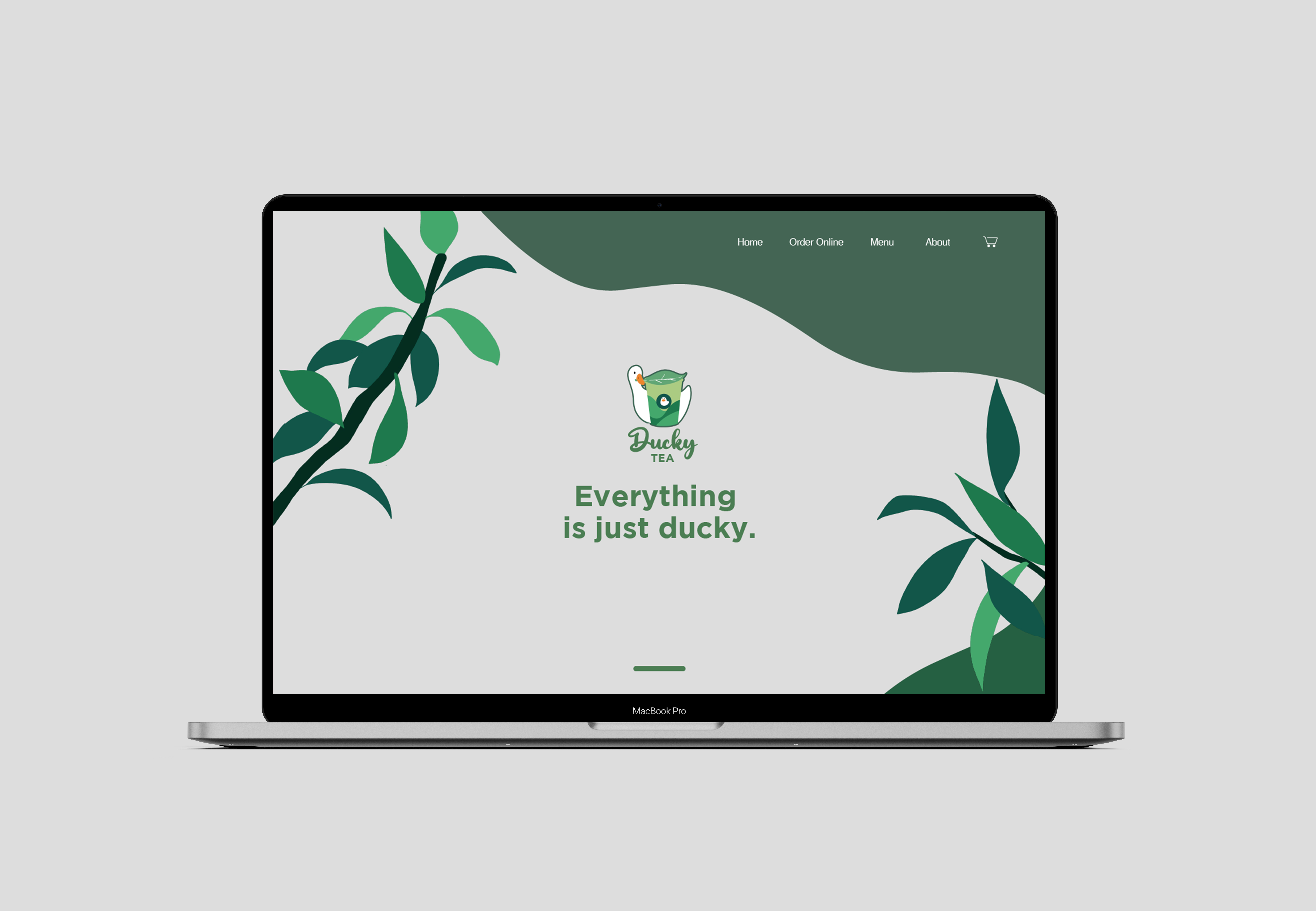
Ducky tea is a brand design project. The name Ducky is actually an intended pun, it means duckling but also means charmful and delightful things. The overall design is combined with green colour palette and concise illustration design to include various groups of people, also to create a relaxed and welcoming brand image.
Process
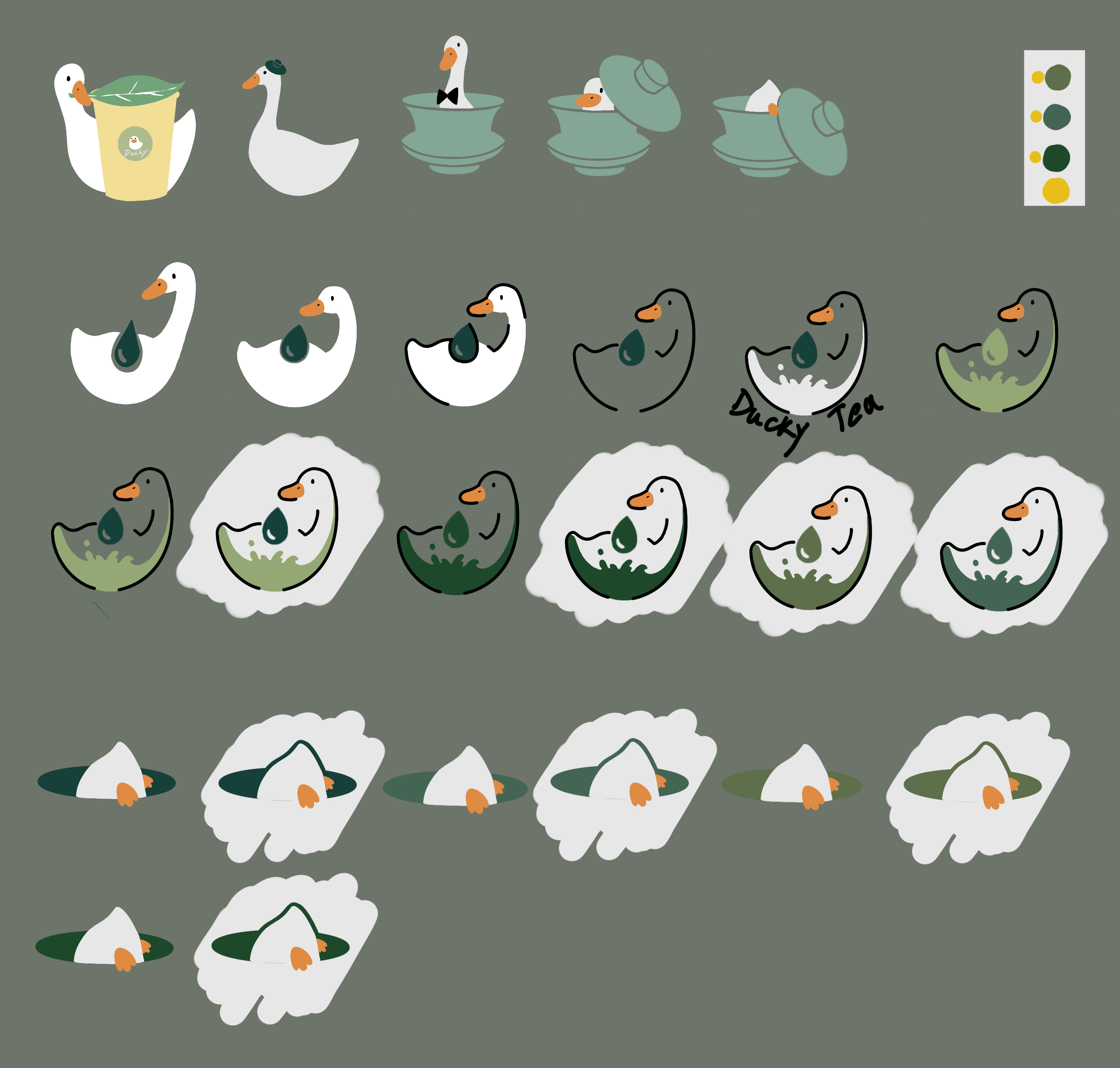
Here shows iterations of the logo design. There are two main directions among the iterations, to combine the image of ducky with paper cup, or to merge the duck shape into a teapot. These two directions will determine what kind of teashop Ducky Tea will be, an innovative Chinese dine-in teashop or a here and to-go teashop. Due to its simple illustrative style, its main customer range will be relatively yonger, so a here or to-go teashop is the final decision.


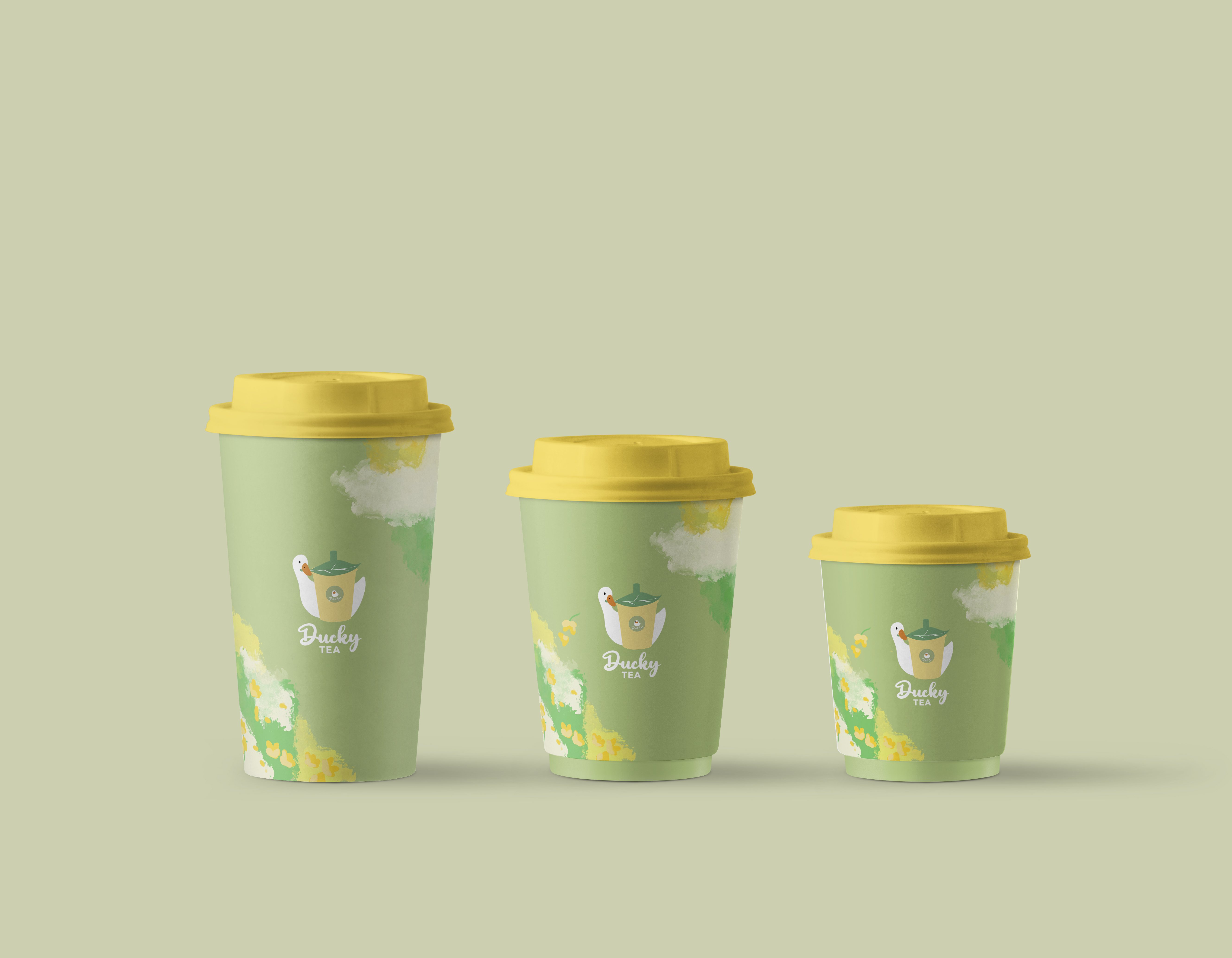
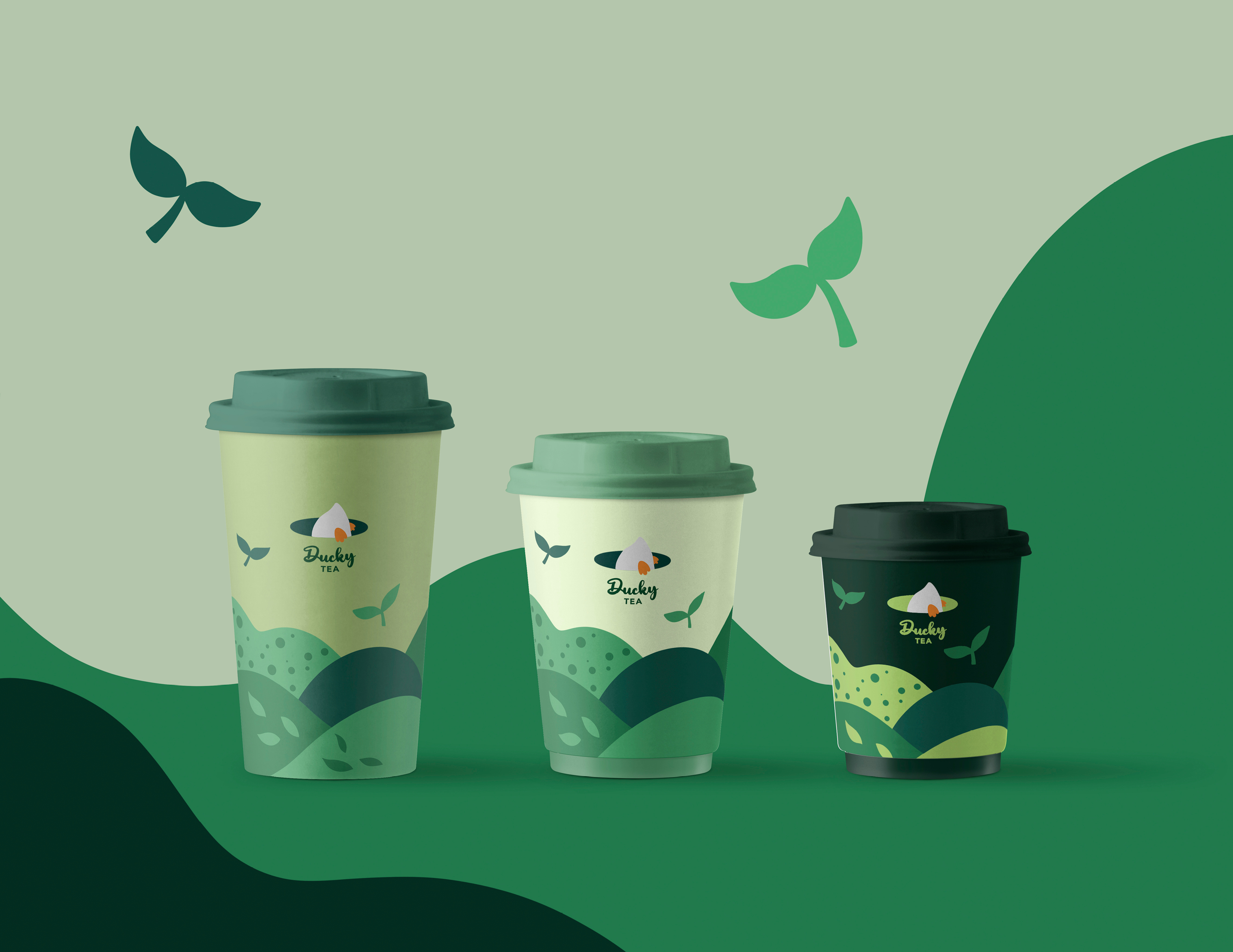
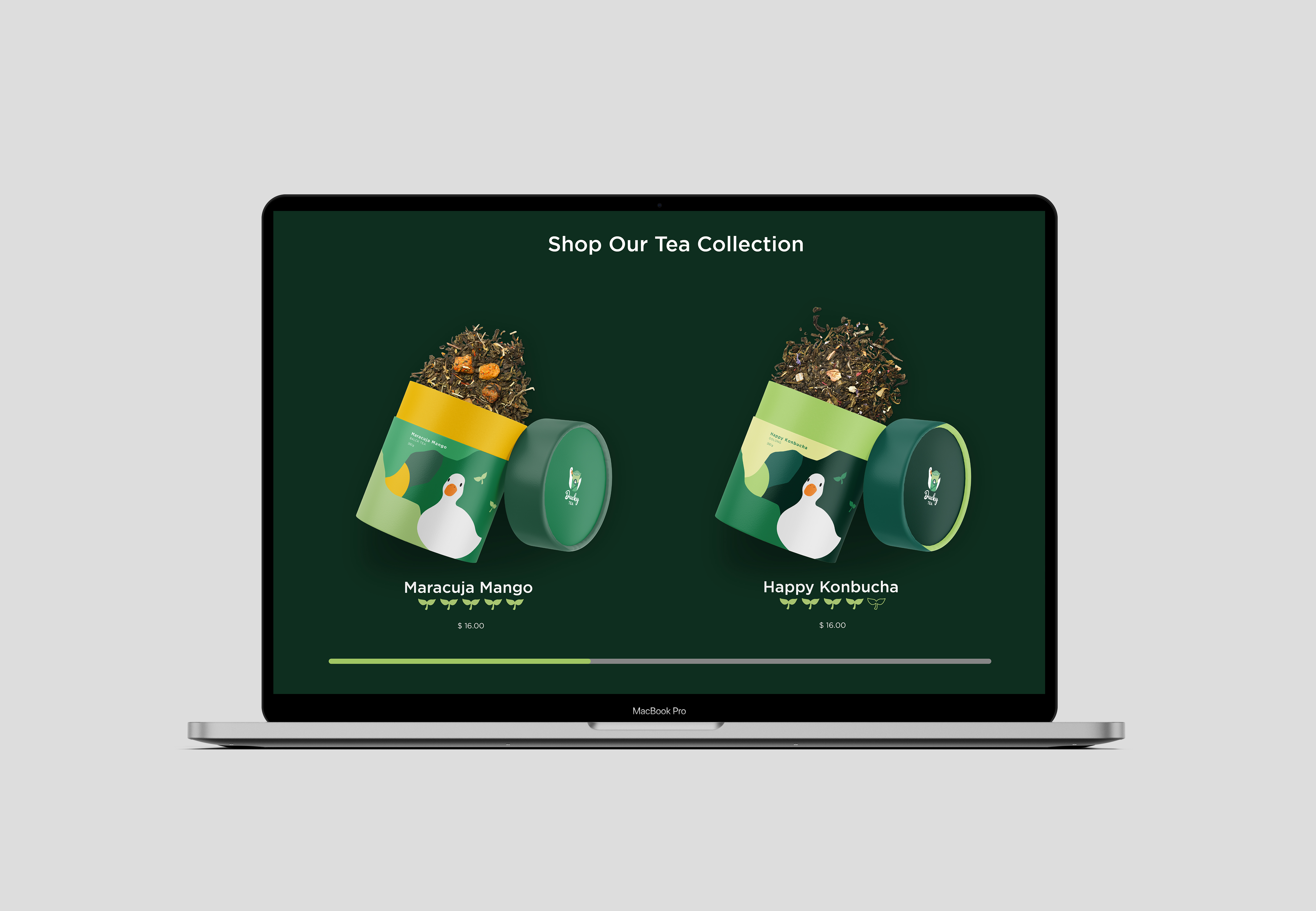
Here are the original ideas of logo and cup design. After doing user survey, the colour scheme of light green and yellow canbe too feminine. To include male customers as the goal of this brand is to create a teashop for everyone to relax, the colour scheme is changed to darker green. And the packaging design becomes more minimal. The colour of cap also changes to different green colour to help people distinguish the size and flavour.
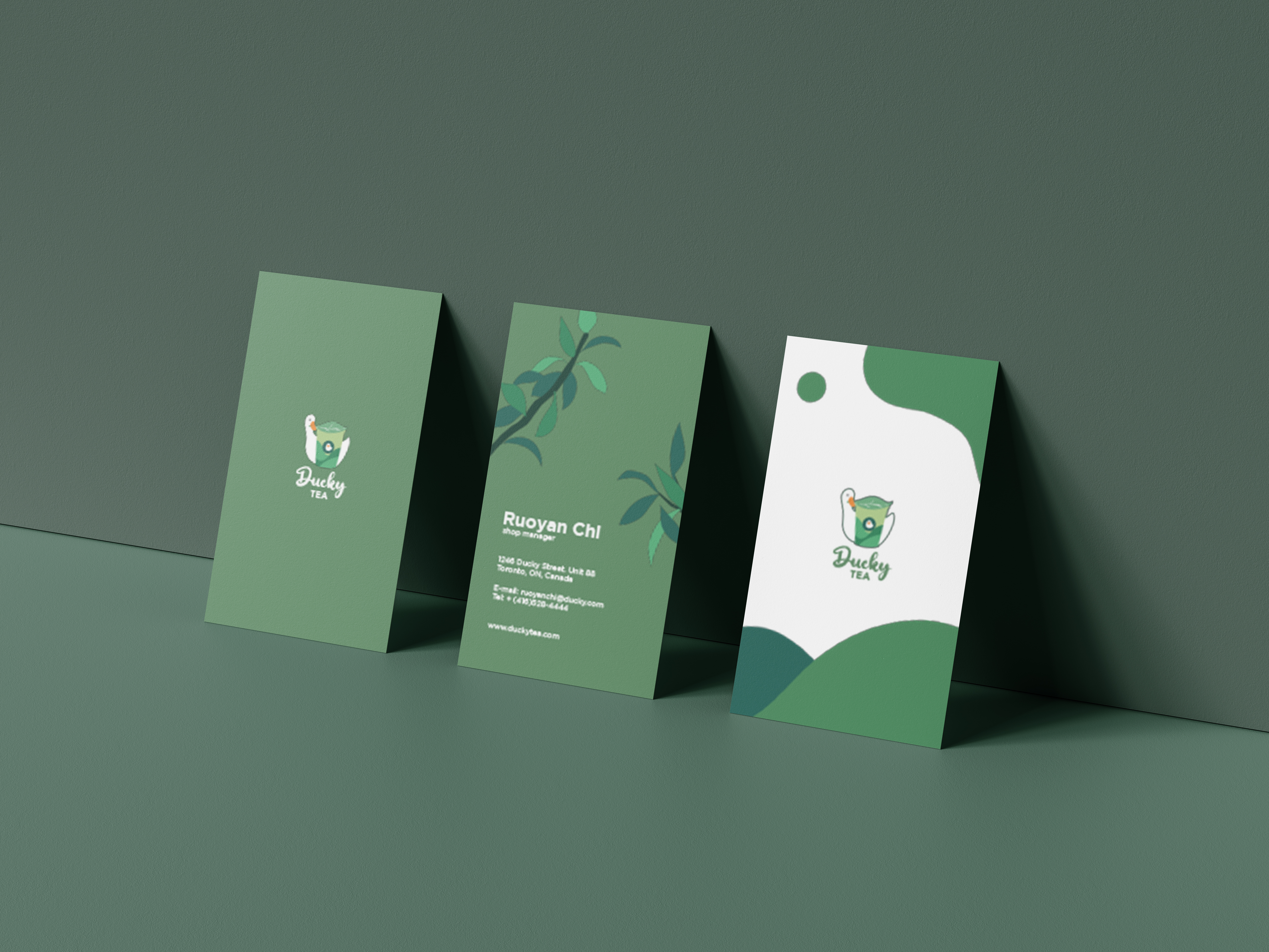
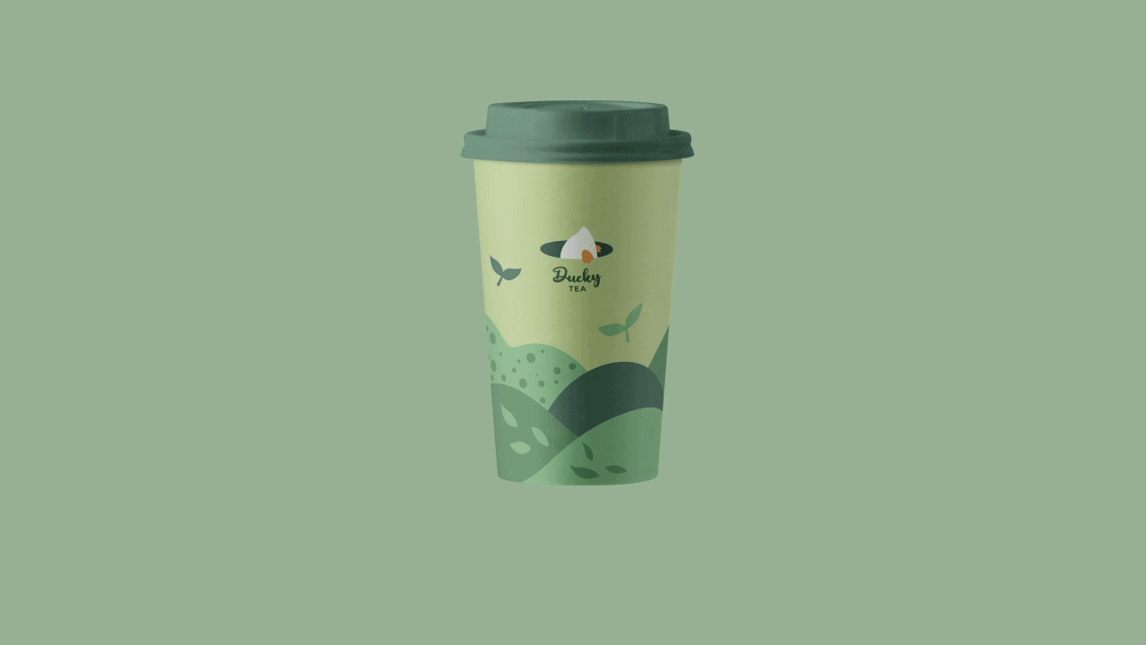
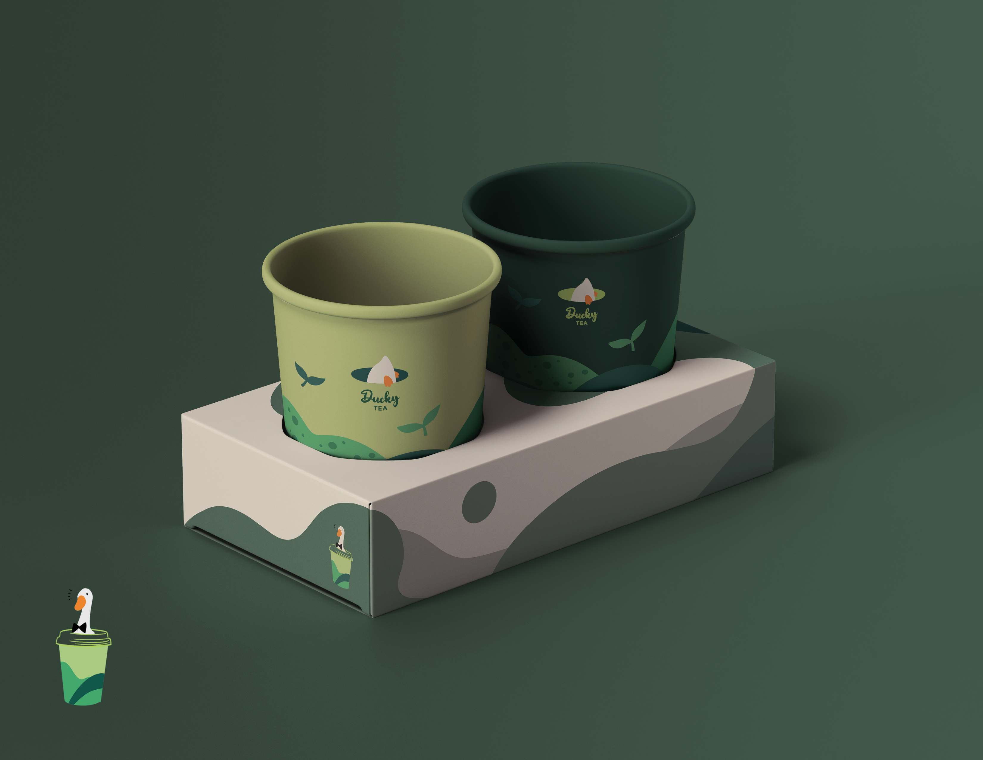
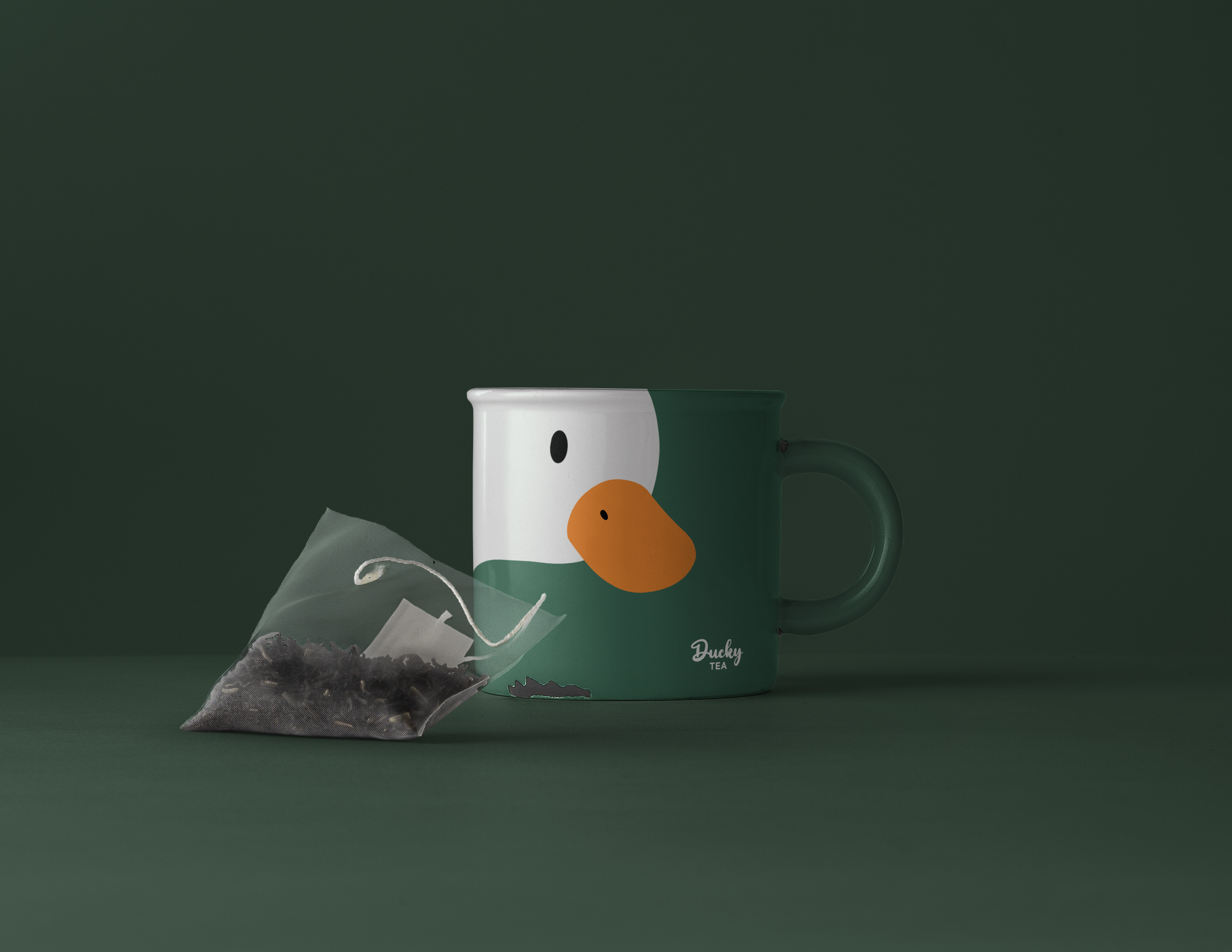
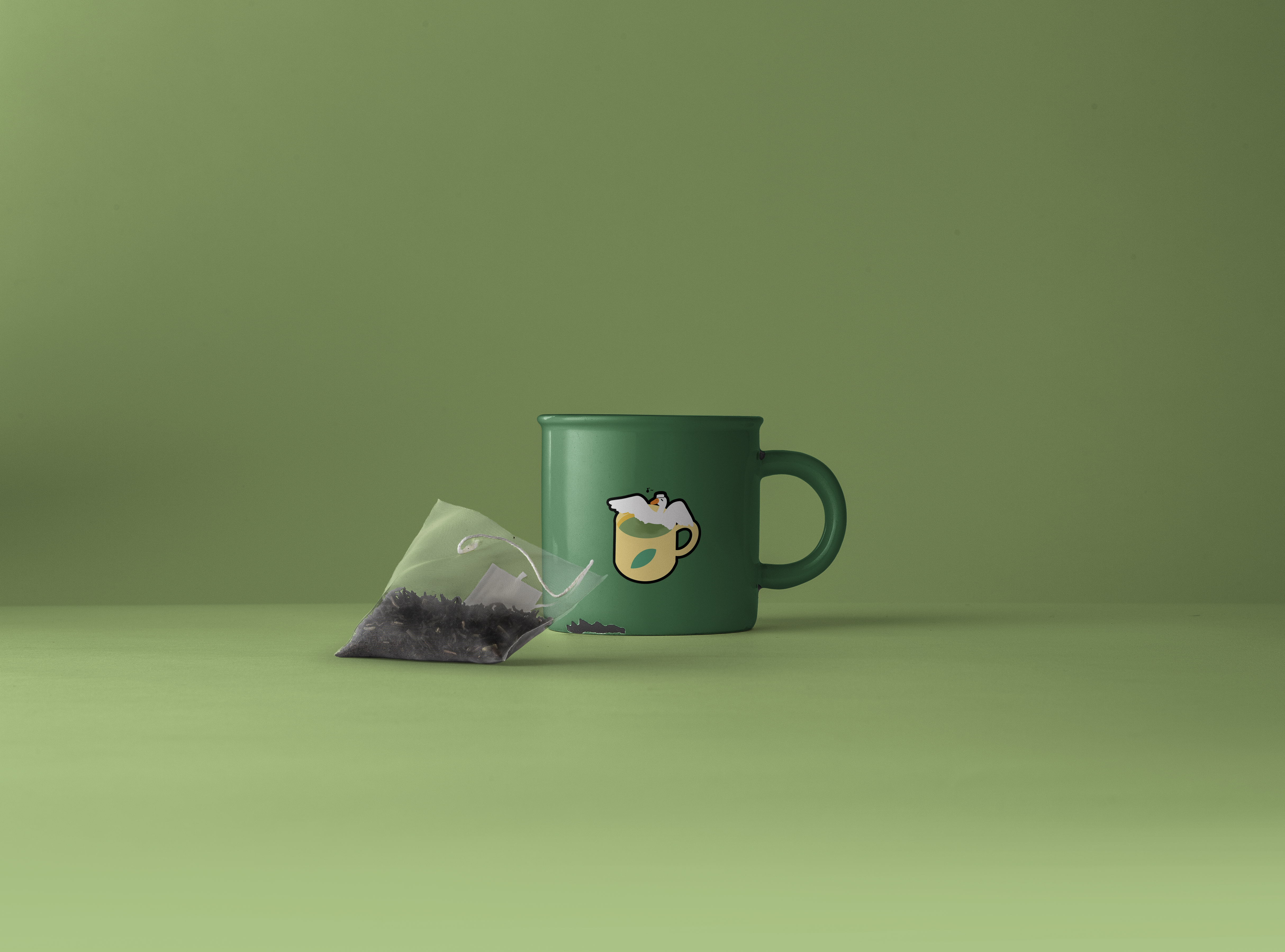
To create brand identity, all products used same green palette with a duckling illustrations. The patterns on paper cups and tea packagings sticked to geometic shapes. The logo used on the cup is different as it is also a pun. The use of negative space is to create a illusion of a duckling is drinking the tea.
Brand Design