Fresh Buttons
Fresh Buttons is a brand design that focus on its packaging design.
The goal and mission of this brand is to be as inclusive as possible, to focus many groups’ needs rather than focus too much on just one group. Just to make everyone’s life easier, to have a solution that can help neglected people while benefitting the majorities.
Design Brief
OVERALL OBJECTIVE:
To make improvements on current fresh food packaging design while including both people with normal vision and people with visual impairment.
MAIN ADVERTISING MESSAGE:
Fresh, Touch, Natural
USP (UNIQUE SELLING PROPOSITION):
- Tactile Labelling
- Braille included
- Fully recyclable package
- Easy open package
EXECUTIONAL CONSIDERATIONS CONTENT:
Main advertising message: To make everyone’s life easier.
Research
Pain points of neglected people:Blind/ Colour blind/ Visual impairment
- Cannot read the text (Cannot tell the expriy date of food) (A simple code like this is better than using
braille)
- Cannot distinguish different prodcut by colour (Legibility and high-contrast graphics)
- Legibility
People with limb disabilities
- Cannot hold/ open the packaging easily
Aging people
- Text size can be too small
- Too difficult to open (too tight, design is too complex)
- Cannot find ‘date of manufacture’ and ‘date of expiration’, and always forget them
Process


Here shows sketches of the container designs. The choices are full-plastic and full-paper, the advantage of plastic is transparent, allowing customers to intuitively see the status of the food inside. The disadvantage is that it is not environmentally friendly. Paper packaging is more environmentally friendly, but its disadvantages are increased production costs, the inability to hold high-moisture foods, and not see-through.
After classmates’ feedbacks, the decision is combine paper and plastic. The lid will be plastic and the tray will be wax treated paper.
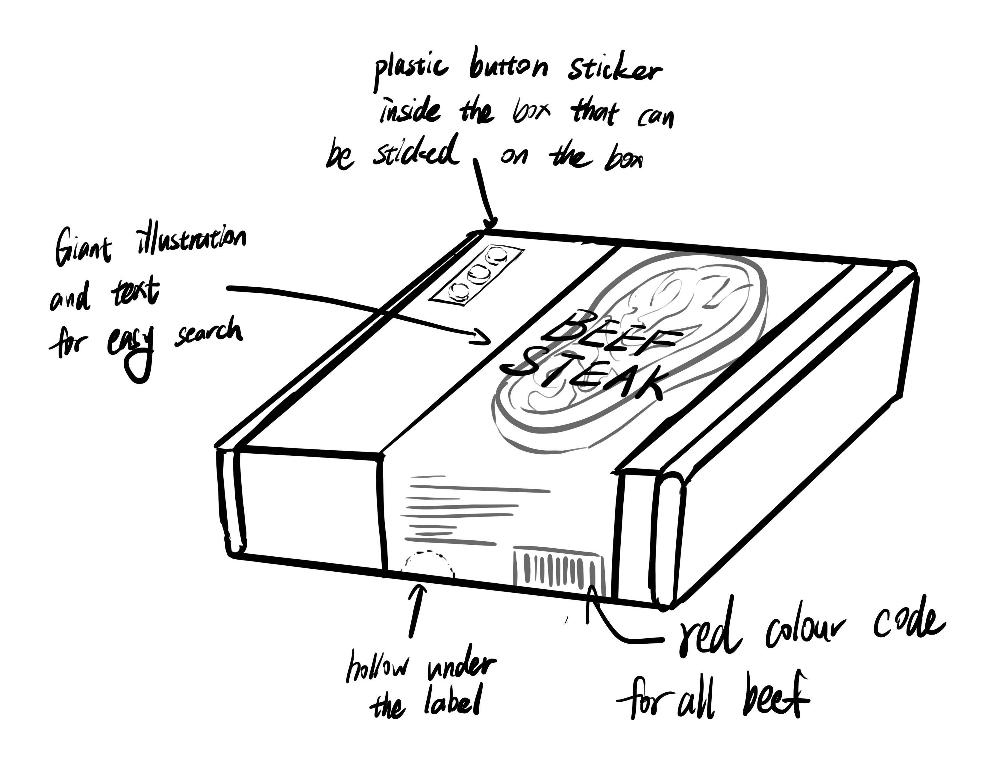
Logo Iterations


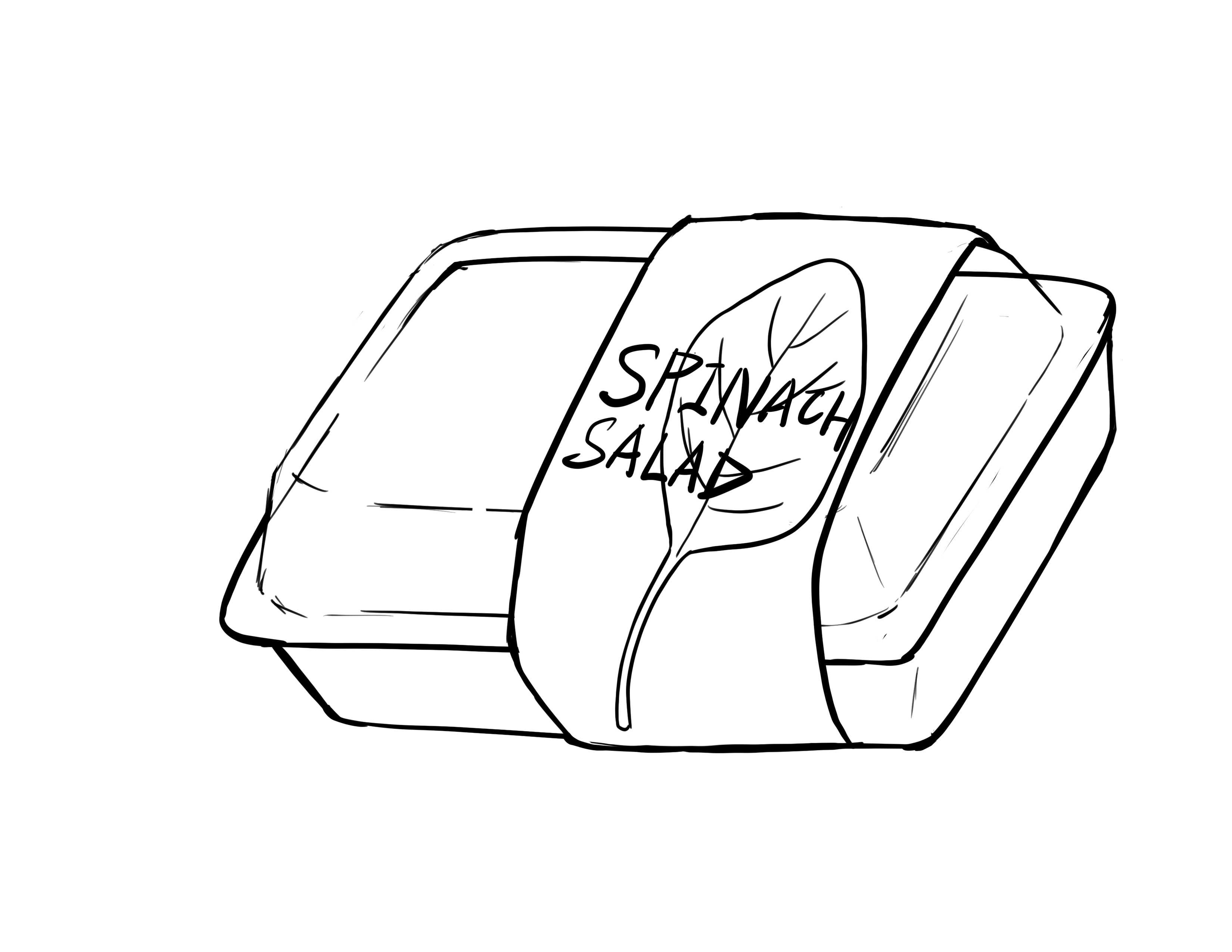
After the iterations, I decided to make the logo simple. There are two versions of the logo, one if for meat and one is for salad. The finger in a rounded square here to show the “tactile lablling“ fuction that the brand focuses on.
Packaging Design


Target Auidence
Geographic: City and/ or suburban living
Economic: Middle
Demographic: Young to Elders
Psychographic: Healthy, Environmentally conscious
Physiological: Visual impairment, Normal vision, Colour blind
Inclusive Design
For the cup lid button idea, since supermarkets in Canada will not change their salad once a day, instead, salad will be sold on shelves for mutiple days. Same as meat. So it will not be so practical to let supermarket employees press down buttons of all salad and meat selling on shelves. And those fresh food’s expiration dates cannot be simply counted by dates after opening. So I did more reseach to look for a better solution.
I found that there is touch-senetive technology existing in the food insutry, which is called
tactile labelling. This little bag showing on the picture can be sticked on the package, and it
inflates to indicate the food inside is not fresj to eat anymore. This was invented by Mimica lab,
and I went to their website know that this can be used on meat packages.
Since it is a new technology, I will consider to add Braille on this little bag to make sure visual
impairment know how this functions.
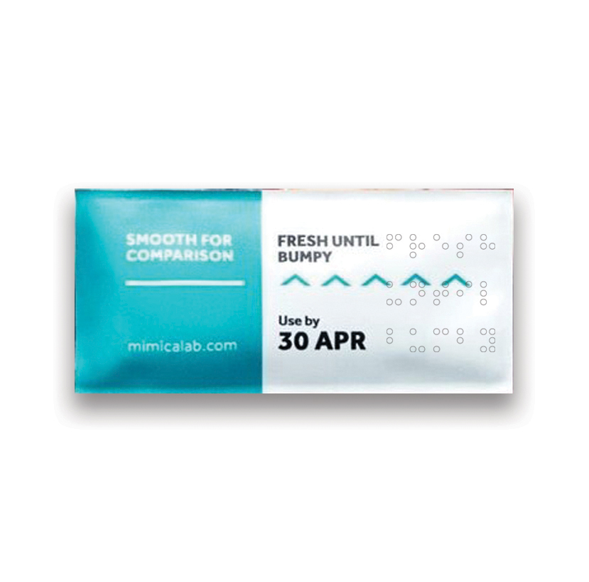 (tactile labelling)
Dielines


